Shift

A collaborative study resource for college students.

Focus:

UI Design

Role:

Solo Project

Affiliation:

CareerFoundry

Overview

Overview

As a UX designer, I prioritize improving my skills across various areas of design. To enhance my UI skills, I recently took on a UI design challenge through a CareerFoundry course. Although it was challenging to focus solely on UI design, it provided an excellent opportunity to apply my UX knowledge in small ways while keeping UI as the ultimate focus.

What was provided?

What was provided?

1.

1.

1.

Expected deliverables

Expected deliverables

2.

2.

2.

Persona

Persona

3.

3.

3.

Pre-established insights.

Pre-established insights.

Understanding the Data

Understanding
the Data

I analyzed these variables for patterns in order to get a better idea of how to best meet the needs of the user through the design of the UI. The conclusion allowed me to establish the following user statements.

increase my academic performance.

Design Preferences

Design Preferences

I was also able to define three design preferences the user had across the board when it comes to applications similar to Shift. Those preferences can be defined by three key areas of importance:

I was also able to define three design preferences the user had across the board when it comes to applications similar to Shift. Those preferences can be defined by three key areas of importance:

Engagement

Engagement

Engagement

Familiarity

Familiarity

Familiarity

Excitement

Excitement

Excitement

The Business

The Business

Pre-established insights, deliverables, and user personas, helped me to start putting together different design ideas in order to help meet the needs of the user. However, to ensure its practicality in real-world scenarios, I incorporated defined business needs. Specifically, I focused on universities that may want to collaborate with a product like Shift.

Needs & Desires

Needs & Desires

1.

Integration with University data and analytics.

2.

Accessibility emphasis, meeting WCAB guidelines for all design elements.

3.

A clean design that is complimentary to the branding of most universities.

Wireframes

Paper Wireframes

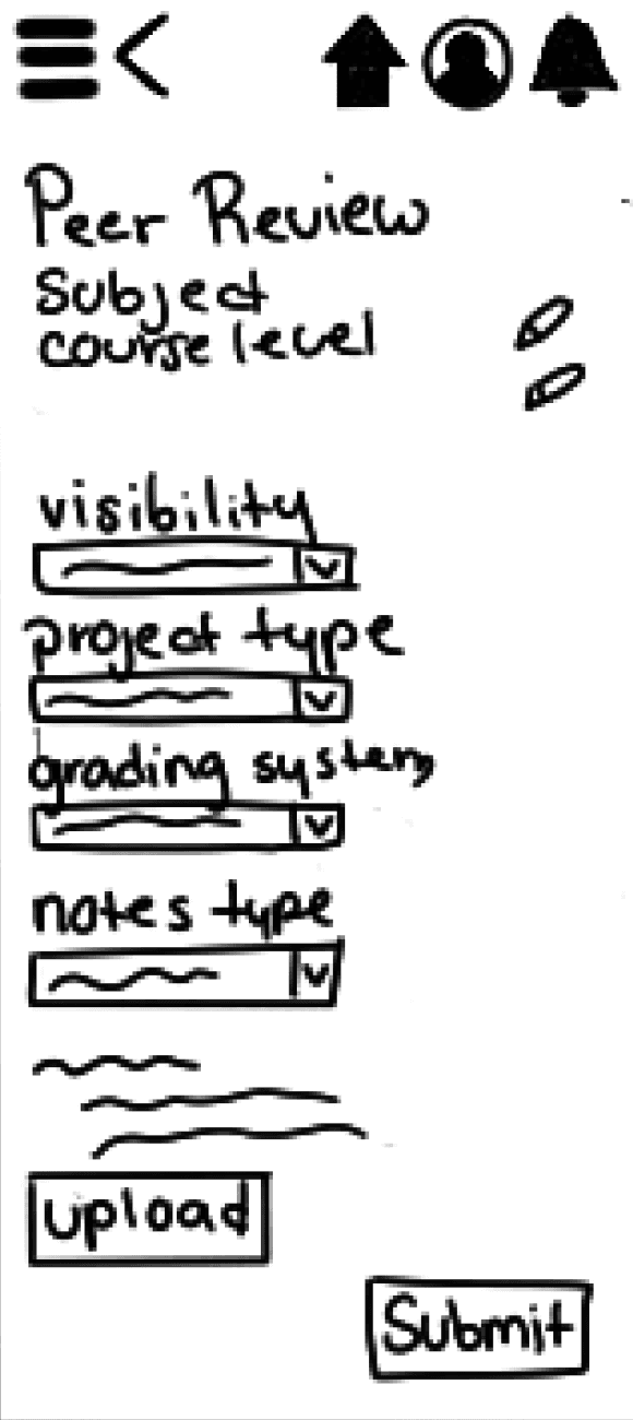
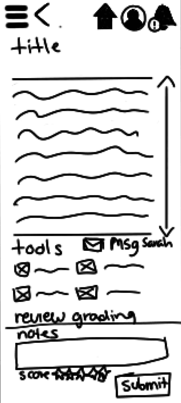
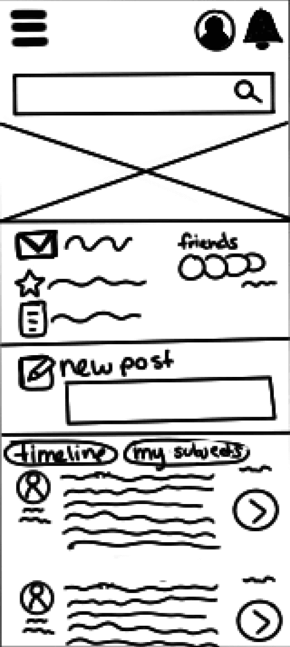
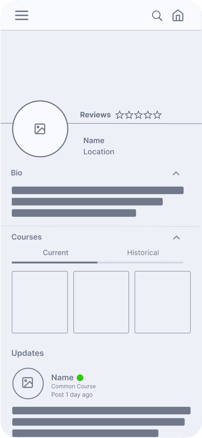
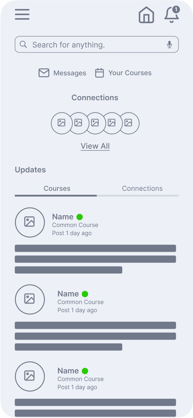
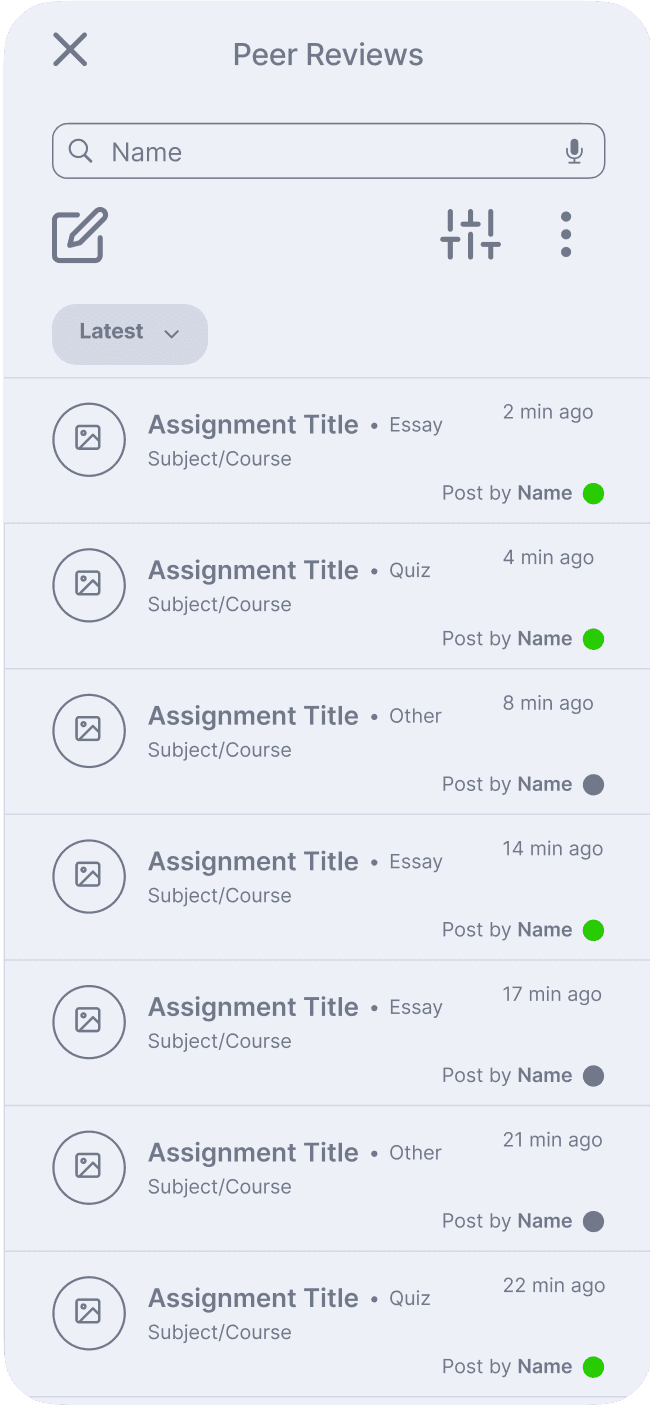
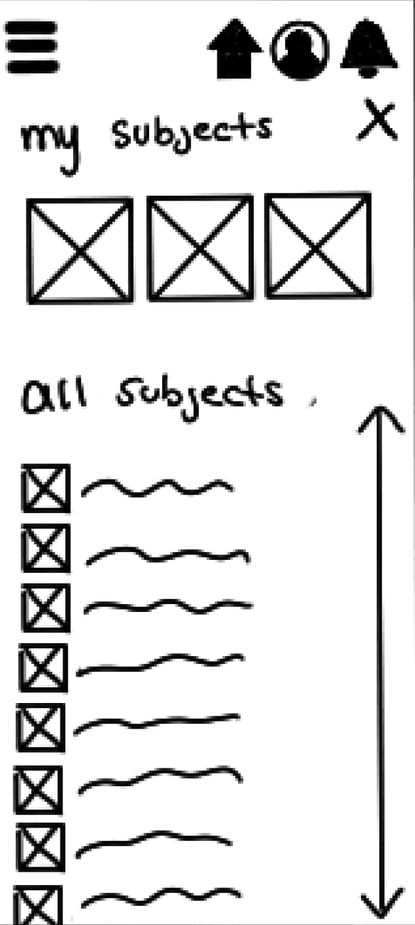
Having gained insight into the user's priorities, I initiated the process of creating 'paper' wireframes on my iPad in order to gain a better understanding of the user's journey.

Mid-Fidelity Wireframes

I then reassessed how completely the initial wireframes responded to the requirements of both the users and the universities, and I made modifications and included more explicit details via Figma in order to generate the following batch of wireframes.

Style Guide

Style Guide

Color

THAI ICED TEA

Primary

#B73625

BACTERIA

Accent

#26886D

BREXIT

Accent

#8E1440

BARNEY

Accent

#891A75

CELERY

Accent

#E9EC17

Typography

Aa

Avenir Next

Use Case:

Primary font used throughout the design. It is meant to emphasize the “modern” side of the design.

ABCDEFGHIJK
LMNOPQRSTUVWXYZ
abcdefghijlklmnopqrstuvwxyz
0123456789

AvertaStd

Aa

Use Case:

Secondary font used to establish an academic sensibility where needed. This is primarily used for headers and buttons.

ABCDEFGHIJK
LMNOPQRSTUVWXYZ
abcdefghijlklmnopqrstuvwxyz
0123456789

Grids

Desktop Grid

Desktop Grid

Desktop Grid
12 Columns

/

64 px Margins

/

16 px Margins

Tablet Grid

Tablet Grid

8 Columns

/

28 px Margins

/

16 px Gutters
Tablet Grid
8 Columns
28 px Margins
16 px Margins

Mobile Grid

Mobile Grid

6 Columns

/

24 px Margins

/

12 px Gutters
Mobile Grid
6 Columns
24 px Margins
12 px Margins

Typography

Avenir Next

Use Case:

Primary font used throughout the design. It is meant to emphasize the “modern” side of the design.

ABCDEFGHIJK
LMNOPQRSTUVWXYZ
abcdefghijlk
lmnopqrstuvwxyz
0123456789

AvertaStd

Use Case:

Secondary font used to establish an academic sensibility where needed. This is primarily used for headers and buttons.

ABCDEFGHIJK
LMNOPQRSTUVWXYZ
abcdefghijlk
lmnopqrstuvwxyz
0123456789

The Designs

The
Designs

01

Landing Page

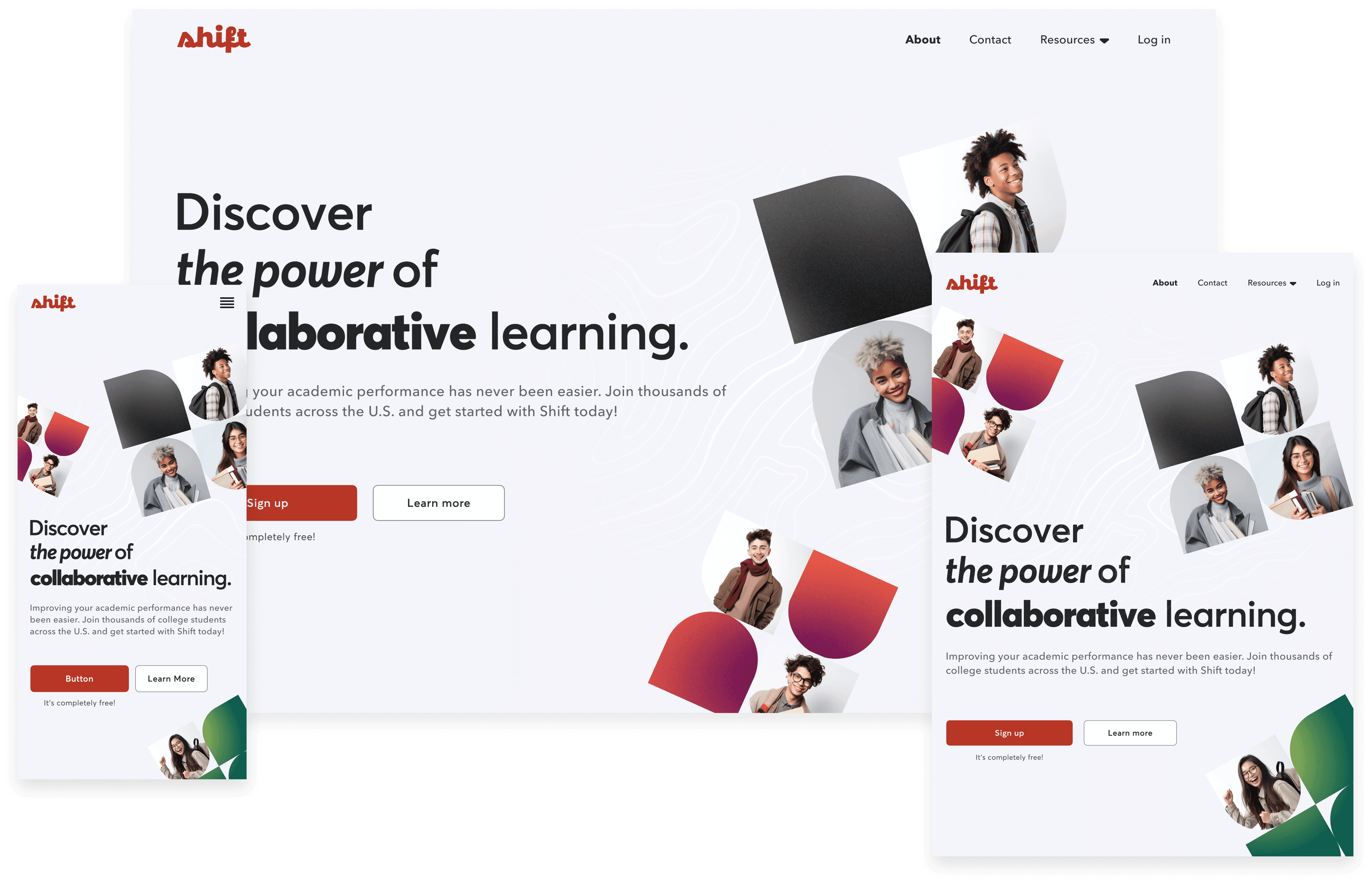
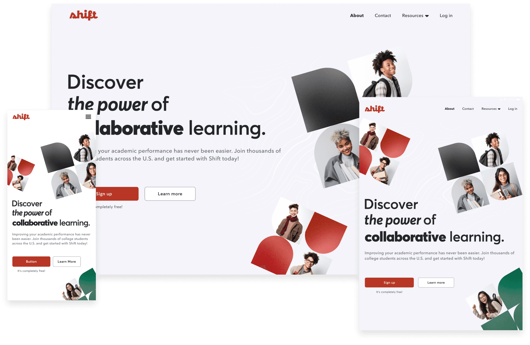
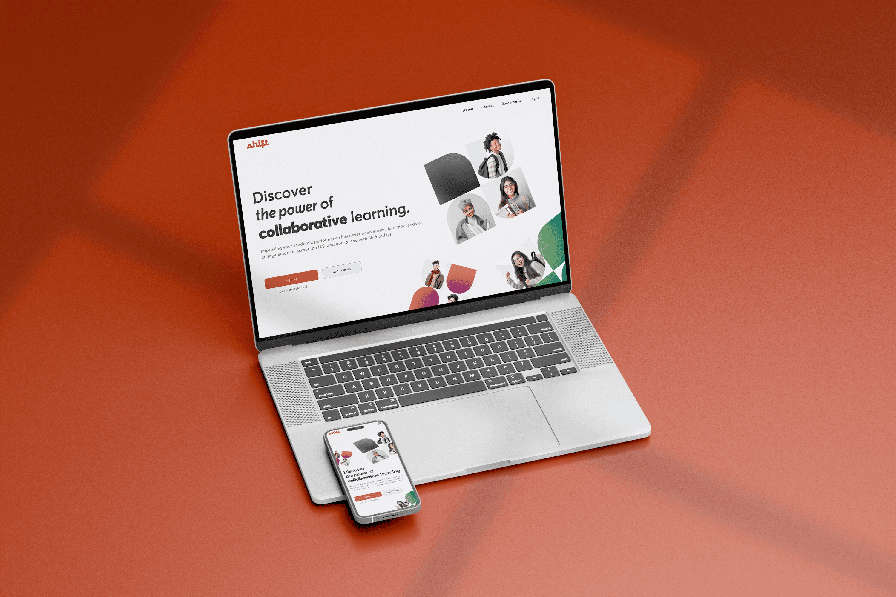
The landing page features smiling students and primary colors, creating a warm environment, welcoming new users. The header focuses on establishing the app’s power to excel academic success through collaboration.

The landing page features smiling students and primary colors, creating a warm environment, welcoming new users. The header focuses on establishing the app’s power to excel academic success through collaboration.

02

Easy Sync

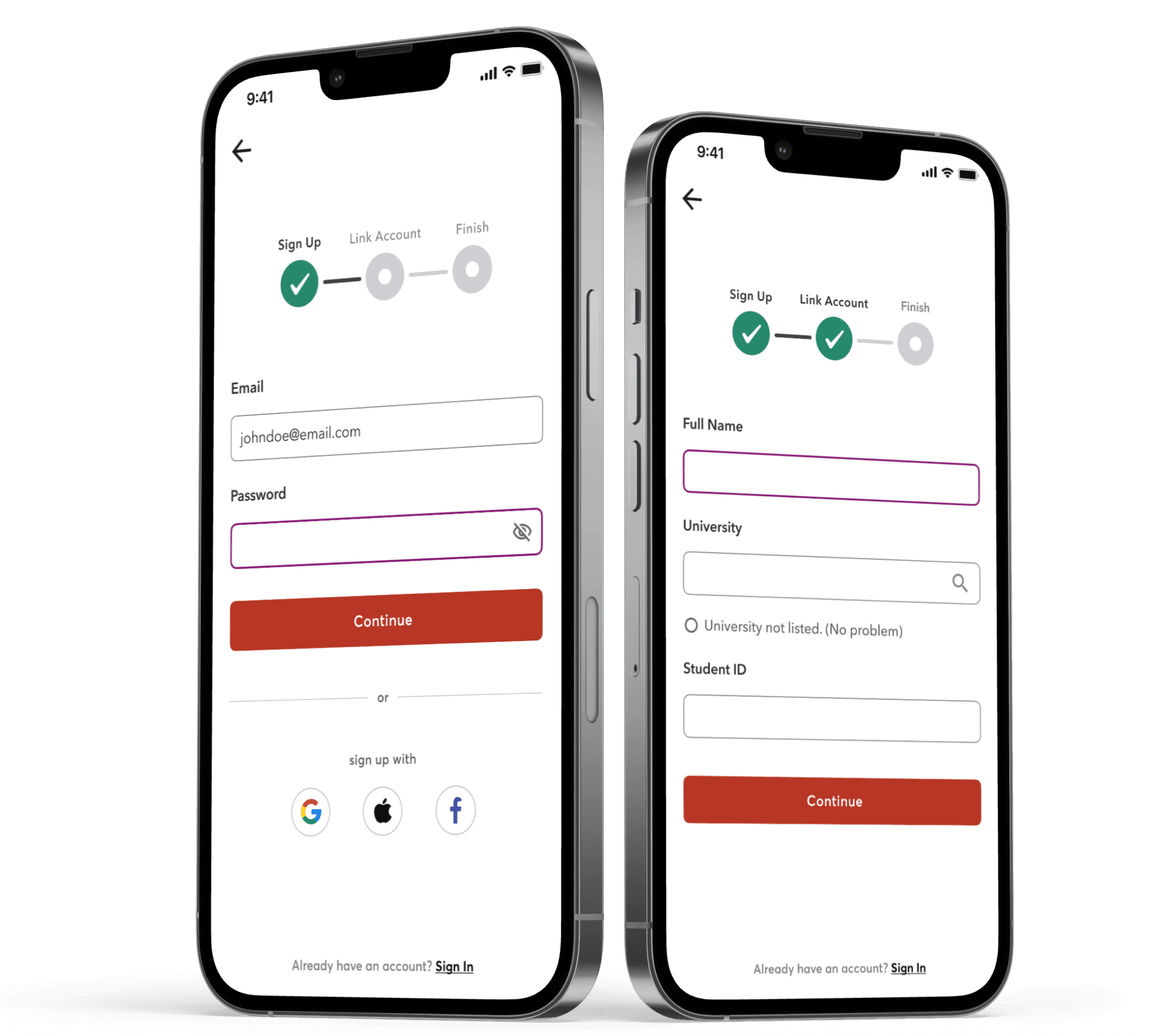
Easy-sync to the student’s university accounts helps to minimize potential pain-points.

Easy-sync to the student’s

university accounts helps to minimize potential pain-points.

University

Schedules

Schedules

Classes

Classes

Grades

Grades

+ more

+ more

Schedules

Schedules

Classes

Classes

Grades

Grades

+ more

+ more

03

University Partnership

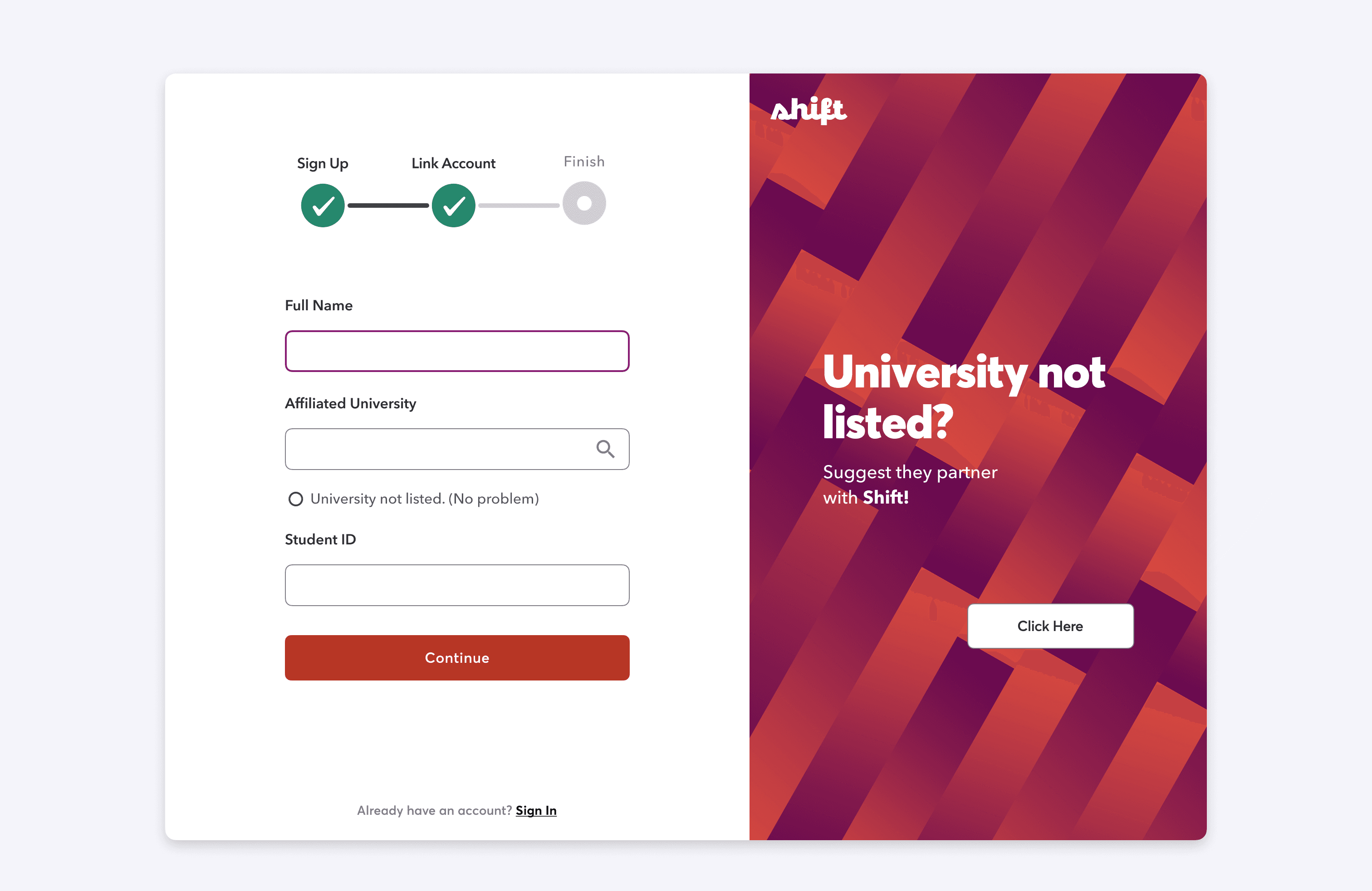
Additionally, I added a way for the user to suggest their university establish a partnership with Shift.

Additionally, I added a way fo the user to suggest their university establish a partnership with Shift.to the student’s university accounts helps to minimize potential pain-points.

04

Peer-Review Tool

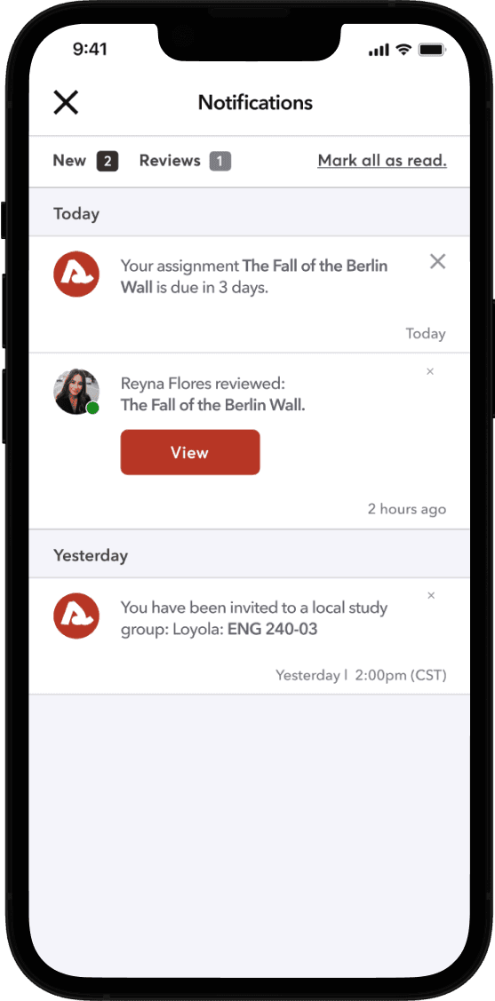
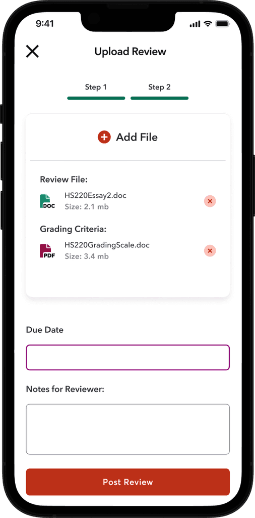
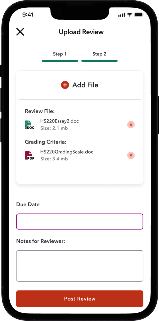
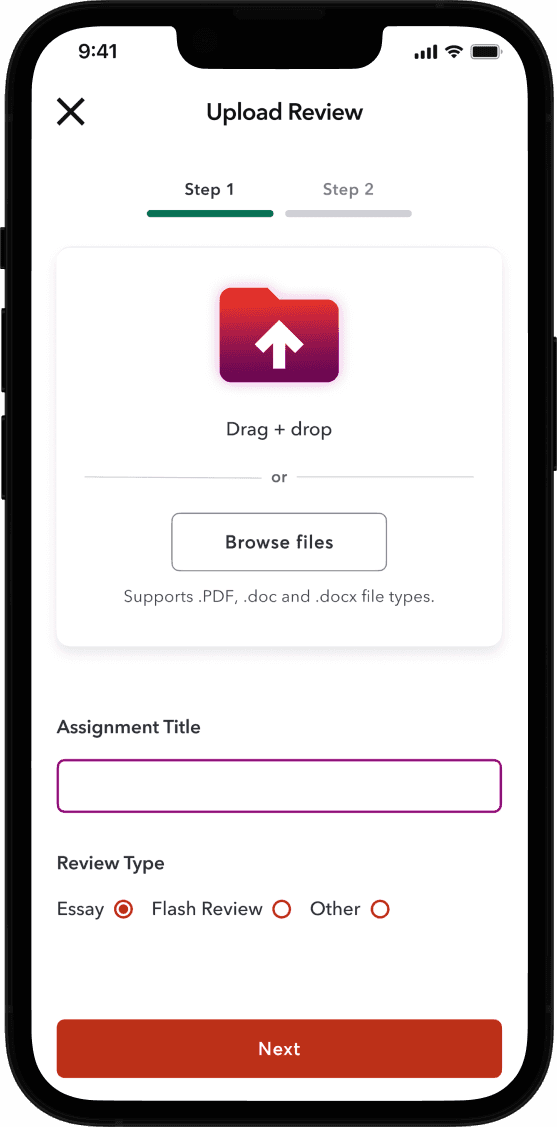
To boost engagement and retention, our peer-review tool follows a 'Give to Get' approach. Students must review their peers' assignments before accessing feedback on their own work, encouraging user engagement and retention.

To boost engagement and retention, our peer-review tool follows a 'Give to Get' approach. Students must review their peers' assignments before accessing feedback on their own work, encouraging user engagement and retention.

05

User Profiles

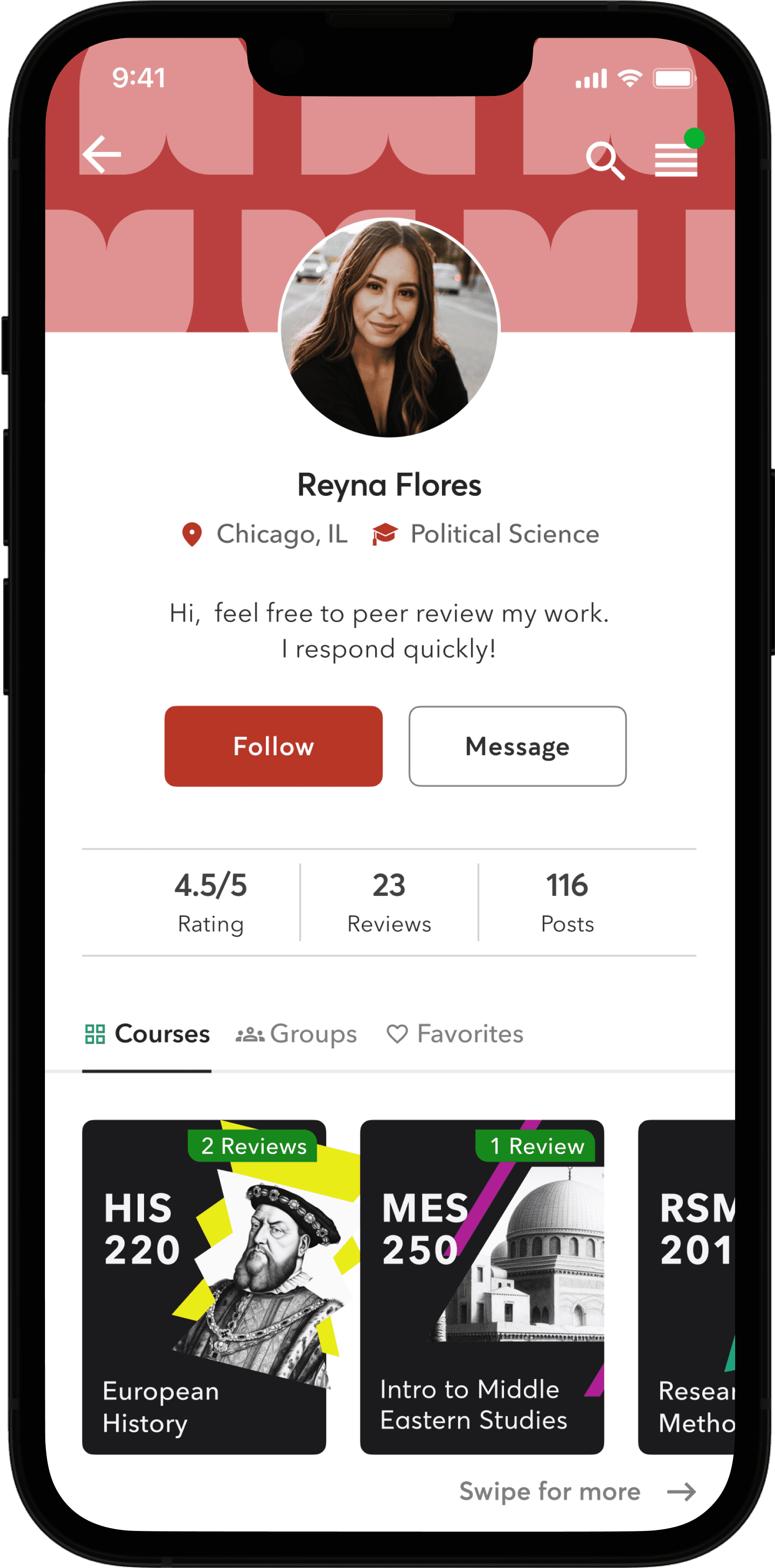
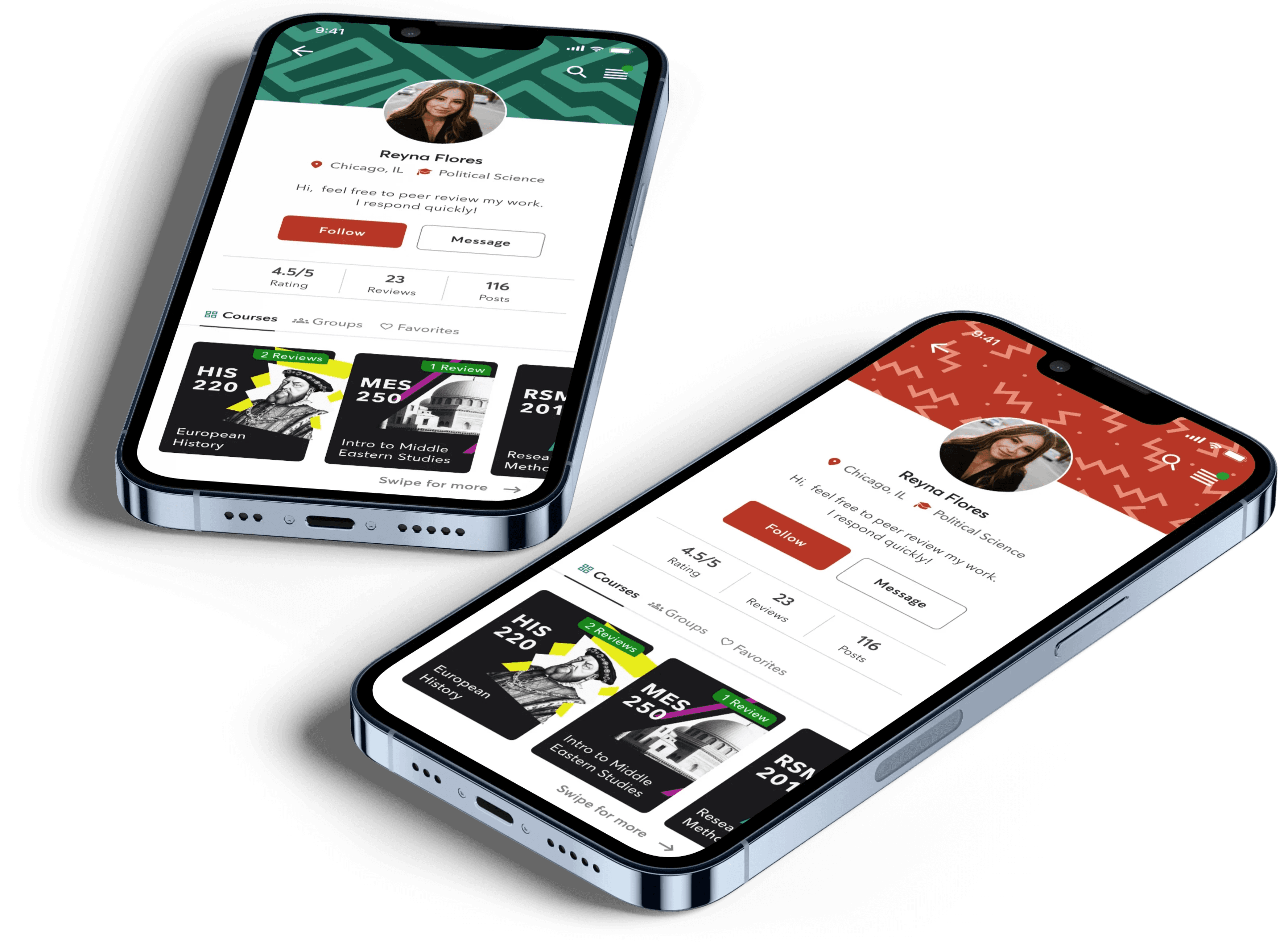
The user profiles were thoughtfully crafted to foster meaningful connections, both virtually and in-person, without resembling a typical social media platform. Balancing multiple connection options while avoiding overwhelming features like media uploads, comments, or likes was key. Users can personalize their profiles with preset backgrounds or upload their own for a unique touch.

The user profiles were thoughtfully crafted to foster meaningful connections, both virtually and in-person, without resembling a typical social media platform. Balancing multiple connection options while avoiding overwhelming features like media uploads, comments, or likes was key. Users can personalize their profiles with preset backgrounds or upload their own for a unique touch.

Key Takeaway

Key Takeaway

Key Takeaway

Setting Strategic Boundaries

When starting this project, I instinctively leaned towards developing a theoretical information architecture as the foundation for my design. However, the project's UI-specific focus made me realize the importance of being more flexible. Relying solely on a theoretical architecture turned out to be inherently unstable. Looking back, a better approach would have been to imagine a scenario where the client requested a high-fidelity UI mockup early on, before finalizing the information architecture. This shift would have encouraged creativity and minimized the constraints, leading to a more efficient design process.

Focus:

UI Design

Role:

Solo Project

Affiliation:

CareerFoundry

Shift

A collaborative study resource for college students.

@ 2024 ALL RIGHTS RESERVED
UX DESIGNER/CHADWICK FENNER

CONNECT

LET'S START
A CONVERSATION!

Email

@ 2024 ALL RIGHTS RESERVED
UX DESIGNER/CHADWICK FENNER

CONNECT

LET'S START
A CONVERSATION!

Email

@ 2024 ALL RIGHTS RESERVED
UX DESIGNER/CHADWICK FENNER

CONNECT

LET'S START
A CONVERSATION!

Email

@ 2024 ALL RIGHTS RESERVED
UX DESIGNER/CHADWICK FENNER

CONNECT

LET'S START
A CONVERSATION!

Email

@ 2024 ALL RIGHTS RESERVED
UX DESIGNER/CHADWICK FENNER

CONNECT

LET'S START
A CONVERSATION!

Email